This article is republished from The Conversation under a Creative Commons licence. Read the original article.
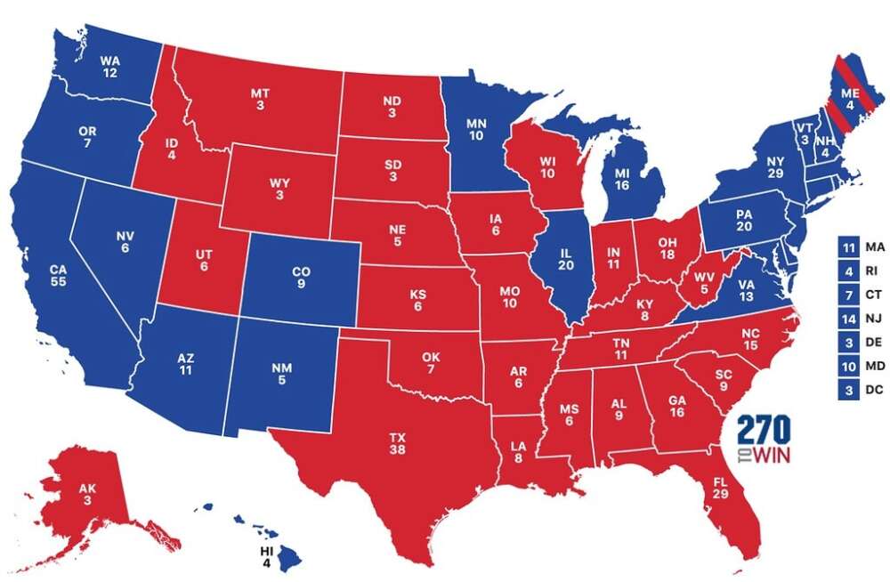
As the world awaited a winner in the U.S. presidential election, people were glued to screens big and small for the latest results to be flashed on electoral maps. But not all maps are created equal.
I tracked 10 election maps from Canadian and U.S. news outlets such as the CBC, Maclean’s, The Globe and Mail, Fox News and the New York Times. While maps have long been used for political propaganda, even maps from sources without a partisan bent “lie.” They are, at best, partial representations of reality — statistical and design choices about what to illustrate and how.
So what did this year’s election maps rightly or wrongly tell us?
Mapping on the web
Since so many of us consume the news online, it was interactive maps embedded in websites that offered the most important windows onto the vote. Professional mapmakers — cartographers — know these tools are both promising and limited.
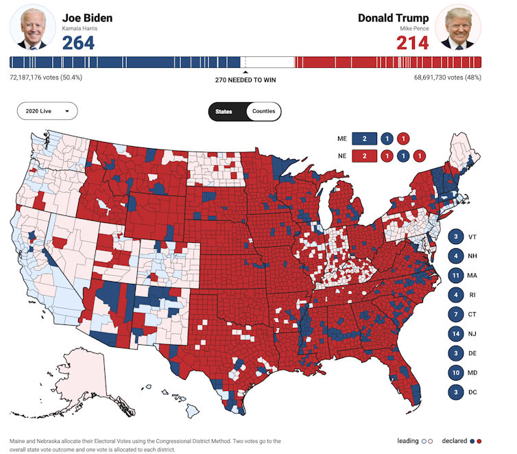
Unlike print maps, web maps often allow their users to customize design. For instance, web maps might allow “re-symbolization” to show the data in a different way. Some interactive maps also let users drill deeper to get “details on demand” — to see county level rather than just national level results.
“Affordances” such as legends that appear when users hover over parts of the map also help put more information on the map and into readers’ hands. Web maps can automatically reload with fresh data, but such updates may be misunderstood if care isn’t taken to contextualize them.

With all this in mind, we should ask ourselves two questions when we look at any U.S. election map.
How complete are the data?
The COVID-19 pandemic has resulted in unprecedented mail-in voting and delays in ballot counting. We knew that many states would take days to fully report their results.
Cartographers use a variety of “visual variables,” such as texture and brightness, in order to represent this kind of information. For instance, Fox News changed the brightness of its map’s reds and blues to illustrate the estimated number of votes counted, with darker colours representing areas that had reported more of their ballots.
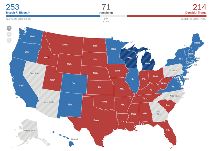
The New York Times used multiple approaches to characterize uncertainties in election results. Some states appear textured, or hatched, because it wasn’t possible to say who had won yet. The percentage of votes counted is indicated in text, as well as in a legend available when users hover over the map. Map readers could click on the state to see which counties were still processing ballots, and the rest of the page provided even more detail.

But what does the map actually show?
The most common American election maps overstate results from rural areas because these consist of large but relatively unpopulated counties and states. The most infamous example is this map of the 2016 election that Trump supporters brought to his defence during his impeachment, and which the president reportedly framed for the Oval Office:
It shows 2016’s results by shading counties according to the party that won them, illustrating that the vast majority voted for Trump. It’s a good indicator that his support in 2016 was widespread in a geographic sense, but it does not actually show that he was popular, because the map does not account for how few people voted in these counties. It’s people who vote, not land.

In the 2020 election, the conservative Fox News was the only outlet I reviewed that allowed its readers to see results in this way. Less misleading approaches showed county-level results using circles coloured by the vote winner and sized according to the number of voters or margin of victory.
But a presidential election map depicting county-level results gives the wrong impression anyway, since this is not how U.S. elections are decided. Trump wasn’t elected in 2016 because he won more ballots than Hillary Clinton, but because he earned more electoral college votes.
Each state has two electoral college votes, plus more based on its share of the total population. What matters is who wins the most votes across the entirety of each state, not in individual counties (though vote-rich counties can certainly sway a state’s final outcome).

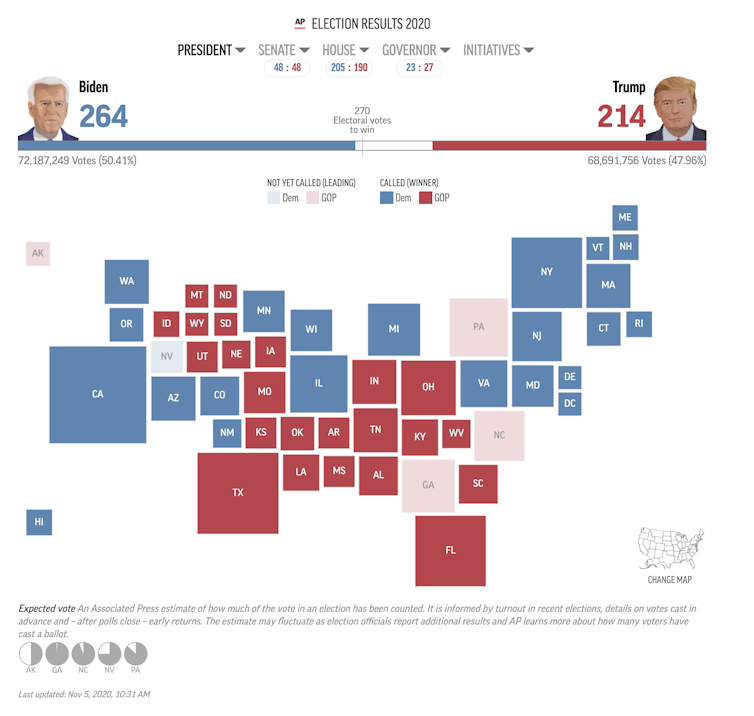
Many election web maps — such as the Globe and Mail’s and Maclean’s (but not CBC’s) — allowed readers to toggle between a more standard view of the U.S. and a view of the states sized by their weight in the Electoral College. These “cartograms” provide the most informative view of who is ahead in the election, even if they are not the most intuitive.
Interactive web maps offer readers a sense of commanding results in real time. But they don’t always tell their readers much about the veracity of those results or how to understand them.
Web maps — whether of elections or pandemics — are not going away, so we would do well to better understand how to make and read them.
By Prof. Eric Nost, Department of Geography, Environment and Geomatics