Barbra Streisand’s The Way We Were was number one on the music charts and All in the Family was the top-rated TV show. Yes, 1974 was an interesting year in pop culture.
It was also the year the University Centre was built, with the orange, grey and brown colour scheme that was popular at the time but looks noticeably outdated today. “It was a classic look in 1974, but it’s not so classic now,” says Bill McNaughton, director of University Centre Administration. “This is one of the central buildings of the campus, often the first one people see, and we want to give a good impression. We want it to look up-to-date.”
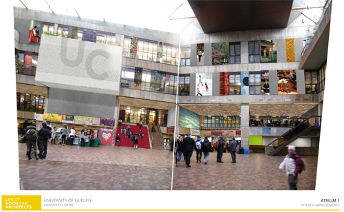
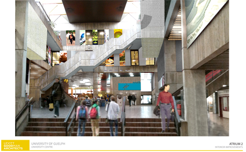
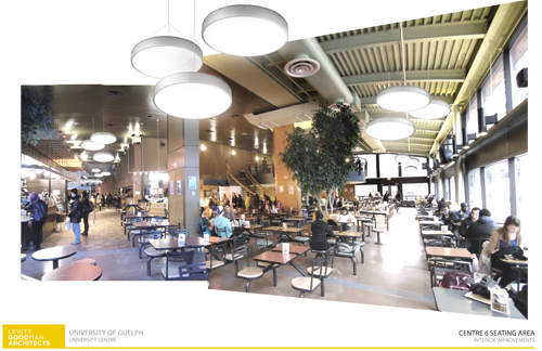
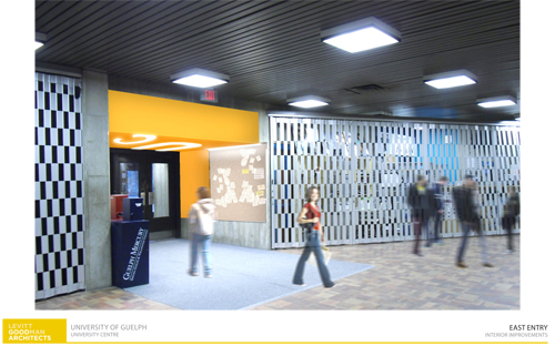
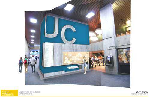
And soon it will. Renovations to the lower level and courtyard area will begin shortly and should be completed before students return in the fall. The consultation process leading up to this point has involved students, faculty and staff and included the University Centre board and a design committee. Levitt Goodman Architects created the design, and tenders were submitted to do the actual work, which includes new lighting, painting, signage and multi-coloured banners.
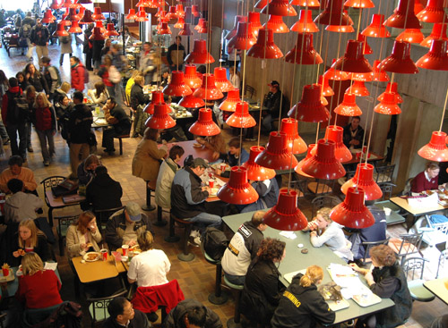
“The new lighting will be in the courtyard but also in the seating area of the food court,” says McNaughton. The overall effect is expected to be brighter but energy-efficient.
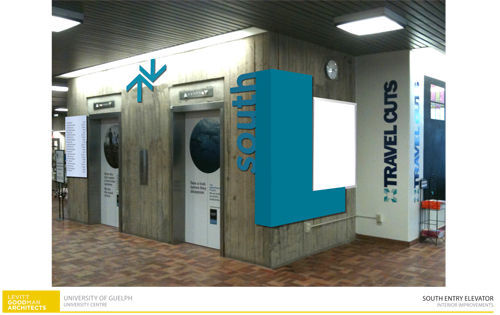
The letters “UC” will be incorporated into the design at entrances and in the central area to help identify the building and add some graphic style. New signs at the elevators will more clearly mark them as north and south; McNaughton adds that the insides of the elevators will get a little TLC as well.
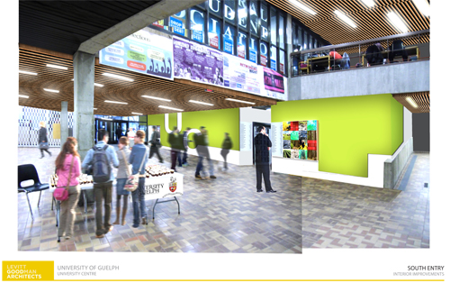
The steps used for seating on the east side of the courtyard will be recovered with a durable, easy-to-clean red fabric. Some wall sections will be painted shades of green or blue. Acoustic tiles on the walls of the upper floors will be repainted grey, replacing the current orange, and some will have colourful banners attached to them. “While we don’t have any plans to change the banners,” says McNaughton, “one advantage of them is that if they begin to look outdated, or we want a change, they can be replaced fairly inexpensively.”
Members of the design committee provided input for the banners and considered various options: photos, graphics, words or combinations of those elements. People can have strong opinions about their favourite designs, says McNaughton, “but in the end, we found ways to compromise.”
What will this mean for people working in or visiting the UC?
“We are planning for minimal disruption,” says McNaughton. Because the building has several entrances, access will always be available; as work is being done in one area, signage will direct people around the construction. McNaughton anticipates that the final results will be well worth any small disruptions. “It’s only a facelift – no structural changes – but it will give the building a fresh new look, a new persona.”
Below are image renderings of the renovations:
