Skip to section on this page:
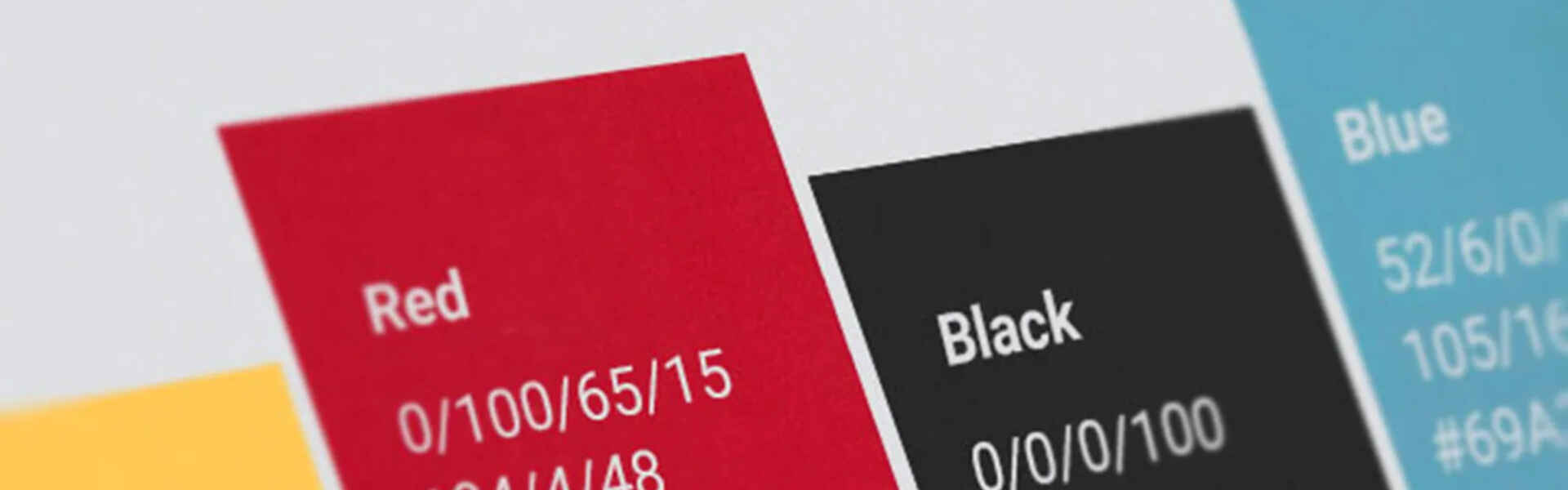
Primary Colour Palette
- Pantone Coated: PMS 200
- Process: C0/M100/Y65/K15
- Uncoated PMS: contact brandguide@uoguelph.ca
- RGB: R194/G4/B48
- Hexadecimal: #C20430
Tip: The U of G red should not be screened or made transparent.
- Pantone Coated: PMS Black
- Process: C0/M0/Y0/K100
- RGB: R0/G0/B0
- Hexadecimal: #000000
Tip: It is recommended that black text on solid white be screened between 100% to 85%.
Secondary Colour Palette
- Pantone Coated: PMS 123 (or 871 metallic)
- Process: C0/M30/Y95/K0
- Uncoated PMS: contact brandguide@uoguelph.ca
- RGB: R255/G199/B42
- Hexadecimal: #FFC72A
Tip: It is recommended that Black text on solid U of G Yellow/Gold be screened at 95% black.
- Pantone Coated: PMS 549
- Process: C52/M6/Y0/K25 *updated on 08/10/17
- Uncoated PMS: contact brandguide@uoguelph.ca
- RGB: R105/G163/B185
- Hexadecimal: #69A3B9
Tip: It is recommended that Black text on solid U of G Blue be screened at 95% black.
* Accessibility note for digital designers: The secondary colour palette should not be used for text on light backgrounds; colour contrast is not sufficient for web accessibility. The secondary palette may be used for text on dark backgrounds or for visual elements that do not convey information. To confirm your colour contrast against the WCAG 2.0 (Level AA) requirement, use a tool such as WebAIM’s Color Contrast Checker.
Colour Palette Do’s and Don’ts
- Do use the appropriate code for the correct medium. Pantone/CMYK Process codes are used for print projects. RGB/Hexadecimal codes are used for digital/web.
- Do consider accessibility when choosing colours and ensure there is enough contrast between backgrounds and text colour.
- Do request a proof or sample before the full print run when working with a new printer or supplier or producing a new print piece to ensure quality control.
- Do confer with existing printers/suppliers and provide updated colour codes.
- Do contact brandguide@uoguelph.ca for Pantone/PMS uncoated colour codes.
- Don’t use the “eye dropper tool” when selecting colours. Always use the provided codes.
Tip: RGB and hexadecimal codes are used to create digital materials (graphics, social media icons, presentations) for screen viewing. CMYK colour codes are used in designs utilizing 4-colour print processing (C=cyan, M=magenta, Y=yellow, K=black). Pantone (PMS) colours are used in single-colour designs and achieve the most accurate representation when printed.
Colour Usage and Proportions
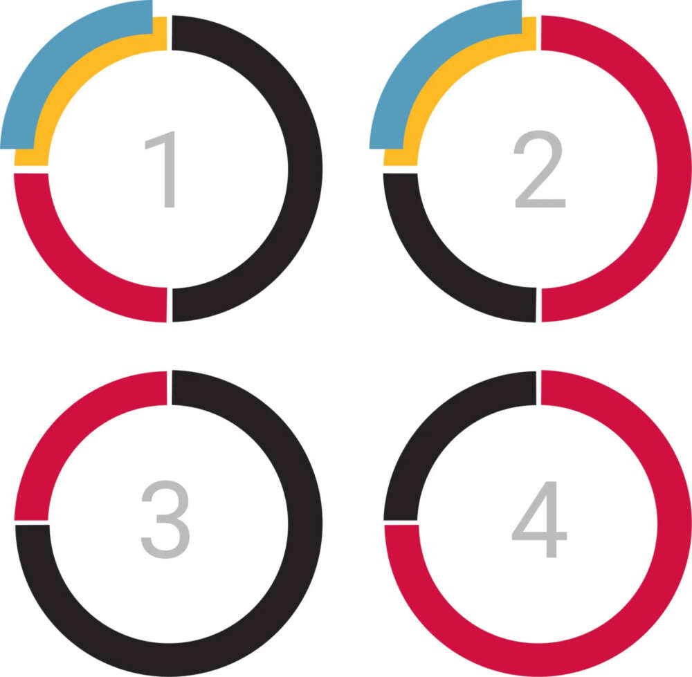
External Communications
The following proportions are the preferred combinations of the University of Guelph primary and secondary colour palette, particularly for all external communications.
- Black: 50%, Red: 25%, Yellow/Gold and/or Blue: 25%
- Red: 50%, Black: 25%, Yellow/Gold and/or Blue: 25%
- Black: 75%, Red: 25%
- Red: 75%, Black: 25%
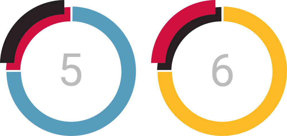
Internal Communications
The following proportions are alternate combinations that may be used in internal communications or secondary pages of a multi-page document.
- Yellow/Gold: 75%, Black and/or Red: 25%
- Blue: 75%, Black and/or Red: 25%