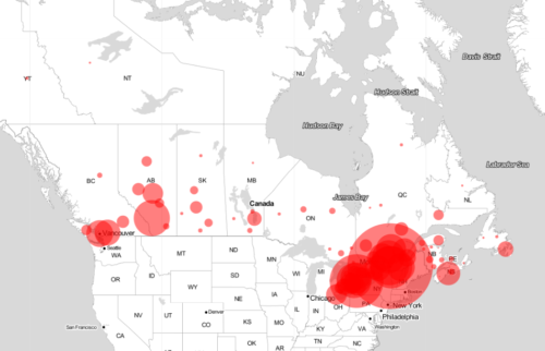
A COVID-19 tracker fuelled by a University of Guelph research team is proving to be a valuable tool allowing researchers, news media and the general public to track pandemic infections across the country each day.
Called COVID-19 in Canada, the online dashboard provides a snapshot of Canadian coronavirus cases and is attracting some 10,000 visitors a day.
U of G volunteers in the Department of Population Medicine are collecting key coronavirus case data and sharing that information with researchers at the University of Toronto’s Dalla Lana School of Public Health to update the dashboard.
A simple map and graph on the site track daily numbers of reported infections, how many Canadians have recovered or died from the coronavirus, and numbers of people tested for the virus in every province and territory as well as nationally.
Each day, six U of G graduate students and researchers compile information from public health units and government health ministries across Canada. The team provides that data in turn to U of T collaborators who maintain the dashboard.

“We want to give an accurate and quickly updated version of what’s happening with COVID-19 as reported, so we can be informing whoever is interested,” said team member and PhD candidate Wendy Xie.
She said researchers might use the data in models to estimate infection rates under various scenarios such as physical distancing measures. Policy decision-makers might employ the information in prioritizing resources for fighting the pandemic or in alerting the public to new measures.
“The goal is to find solutions to help decrease the maximum number of infections, so our health-care systems are not overwhelmed,” said Xie.
The U of G team is supervised by population medicine professor Amy Greer, who holds the Canada Research Chair in Population Disease Modelling.
Although similar databases have begun running in Canada, the U of T dashboard has been tracking infection and death rates since mid-March. That gives users a view of how the disease has progressed since stricter physical distancing measures came into effect across the country, said Isha Berry, a PhD candidate at U of T who had begun collecting data earlier.
She teamed up with U of T PhD student Jean-Paul Soucy to develop the dashboard.

Their supervisor, David Fisman, an epidemiologist and adjunct professor in U of G’s Department of Population Medicine, asked Greer for help in collecting and curating information for the tool. About 15 people, including the U of G researchers, belong to the COVID-19 Open Data Working Group based at U of T.
Berry said the site provides an accessible look at infection trends that helps validate policy decisions, especially physical distancing efforts to “flatten the curve” and avoid overwhelming health-care providers.
The dashboard’s data and overall trends match those of other information sources, said Soucy.
Underlining the project’s accuracy, Xie said the site’s graph for Quebec shows a jump in cases in mid-March reflecting a change in reporting of the province’s coronavirus test results.

“Being involved in this project has been gratifying, you have a sense of contribution,” said Xie, whose PhD studies involve influenza in poultry.
Team member Gabrielle Brankston, research coordinator in Greer’s lab, cautions that the dashboard provides a snapshot based on illness occurring about two weeks earlier. Testing criteria vary across provinces and results may be delayed, she said – and the site’s statistics don’t include information about people who show symptoms but are not being tested.
“What’s important about the dashboard is that it’s a Canada-wide description of lab-confirmed cases,” said Brankston. “Before this, there was no solid compilation of timely information that I could consult every day.”
Similar information is tracked on a dashboard developed by the Public Health Agency of Canada. Brankston said that because the U of T initiative collects information directly from provincial health units, “our dashboard has the most updated case information for Ontario.”